UX/UI Designer
Pencil, Sketchbook, GSuite, Draw.io, Optimal Workshop, Sketch, Invision
Travelher is a capstone project for Springboard's UX Design skills track. The purpose of this course was to have students become familiar with User Experience Design fundamentals by taking them through a series of curated coursework that will prepare students for a career in User Experience Design.
My capstone project idea came about after hearing numerous stories of women being stalked and/or harrassed by random strangers when traveling.
Companies like Uber are creating features on their apps to make it easier for people to reach out for help when they are potential victims of kidnapping, stalking, random attacks, etc.
For the capstone project, students go through the design process they learned throughout the course to create a mobile or web application of their choice as their final project.
After hearing about the various stories of women being at risk when traveling alone, it gave me the idea for my capstone project, to create an app with women in mind, to notify their family and friends of their whereabouts and either their family or the individual woman can notify someone for help immediately if something doesn’t seem right.
After I thought of an idea for an app I wanted to design, I developed a research plan that encompassed three steps:
1. Screener survey
2. User interviews
3. Analysis of findings.
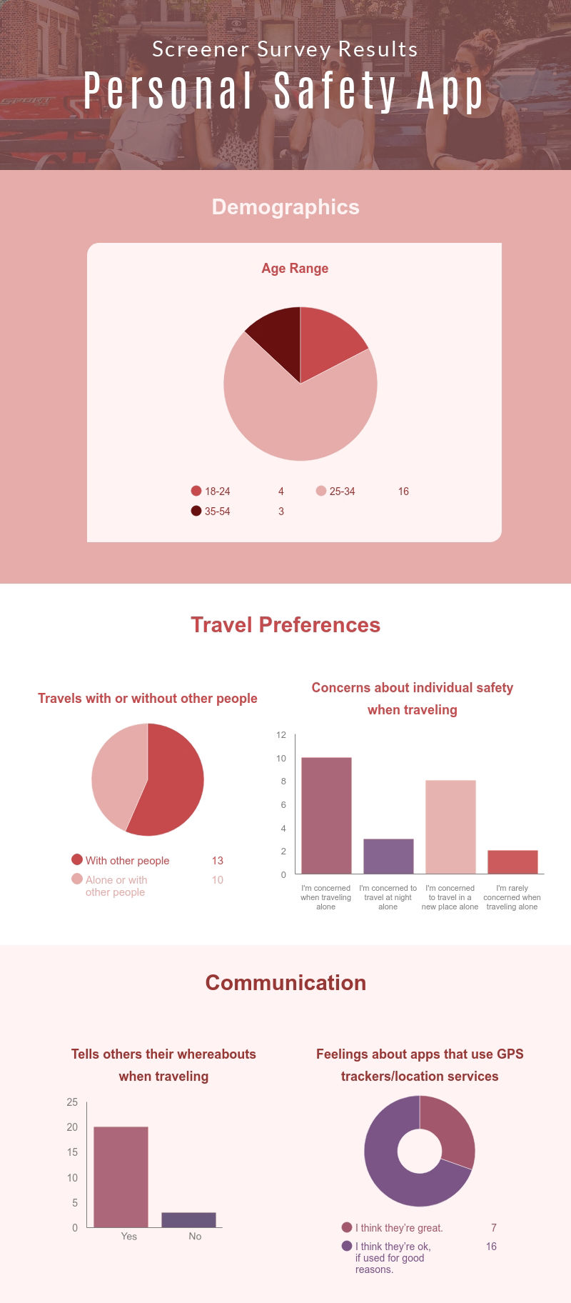
Survey Details
The purpose of the screener survey was to find people in my target user group. There were a total of 20 participants in the survey who responded to the five questions in the survey.
Survey Findings
All the participants in the survey were women of various age ranges and travel patterns. Respondents seemed to be open to using an app that tracked their location if it were used in a way that was beneficial to users. The infographic below shows additional demographics and user responses.
User Interviews Summary
Out of the 20 participants in the screener survey, I selected three women to interview remotely in order to obtain further information about my target demographic for my app.
I asked each participant a total of 13 interview questions pertaining to their previous solo travel experience.
Interview Results
• Two out three traveled alone to only meet up with someone once they reached their destination.
• All three participants were uncomfortable with traveling alone at night.
• Interviewees felt their gender was the reason why they felt unsafe traveling by themselves because they could not defend themselves as easily as a man could.
• All women interviewed preferred to let their families know where they were via regular text, WhatsApp or video chat.
• Participants try to be aware of their surroundings and are more alert when traveling alone and to a new place.
• Two out of three use iPhone’s Family Sharing feature which allows them to share their location with their contacts.
After conducting the interviews, I did a competitive analysis of three equivalent safety apps: Shake2Safety, bSafe and Circle of Six. I evaluated them using three of the Nielsen Norman Group's Usability Heuristics.
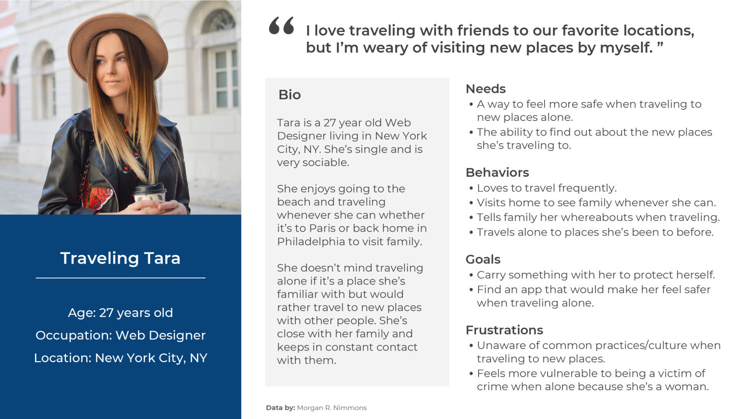
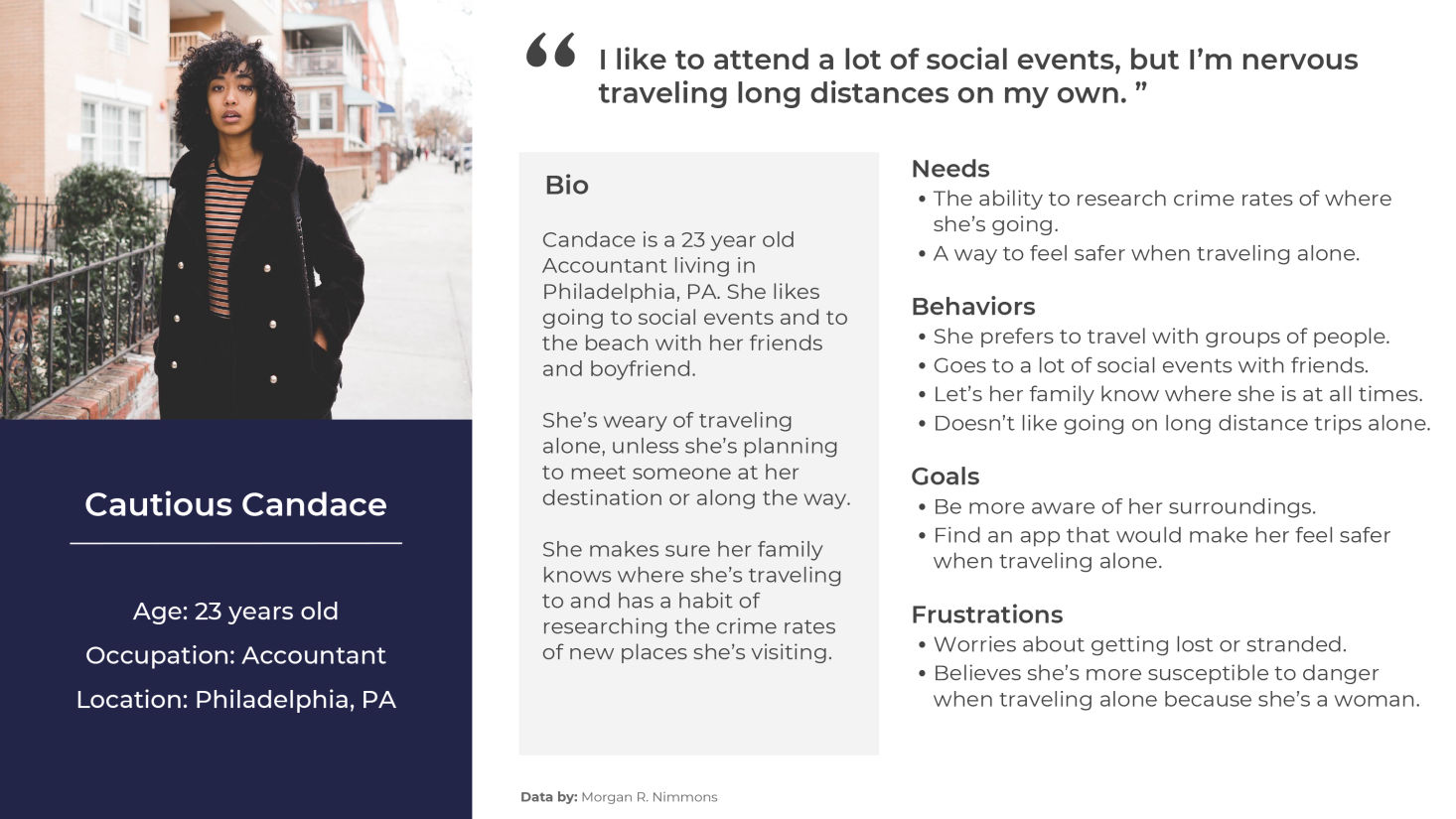
After reviewing the results of the survey, I established user personas based on the data I gathered. Prior to developing the personas, I created empathy maps that would help formulate the personalities of the personas. Two personas were created: "Traveling Tara" and "Cautious Candace."
Empathy Map 1: "Traveling Tara"
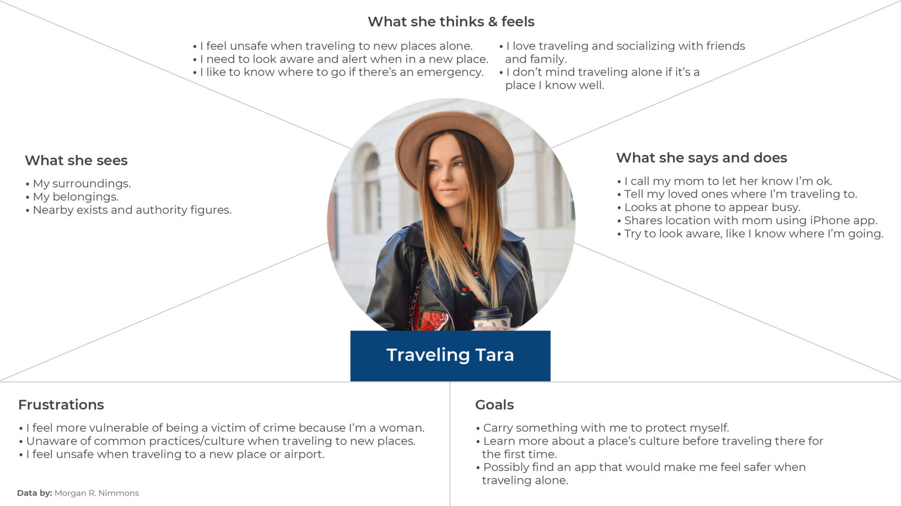
Persona 1: "Traveling Tara"
Empathy Map 2: "Cautious Candace"
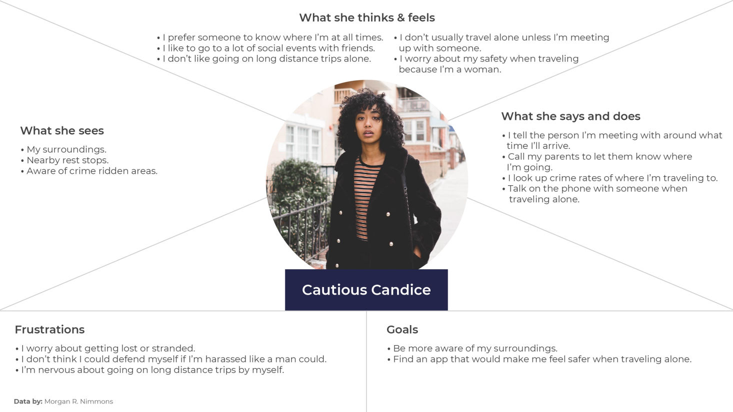
Persona 2: "Cautious Candace"
Based on the insights obtained from the research analysis and user personas, I was able to develop the key features to establish the MVP of the app. Additionally, identifying these features allowed me to create user stories based on what the target audience would need to utilize a safety app for traveling. The MVP and user stories were created in Google Sheets.

In order to validate the information architecture of my travel and safety app, Travelher, I asked six individuals to complete two separate card sort exercises; one with empty categories where they had to create their own and another with preset categories, with the option to make new ones.
The card sort encompassed 30 tasks and features related to the app and participants were asked to group the tasks into associated categories.
I created a sitemap after analyzing the data from the card sorting exercises. I took note of patterns and pairings participants made for the given tasks.

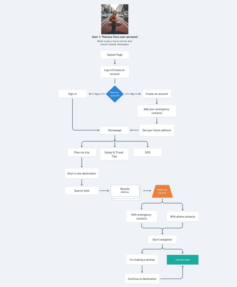
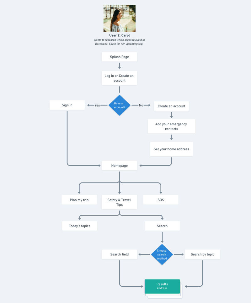
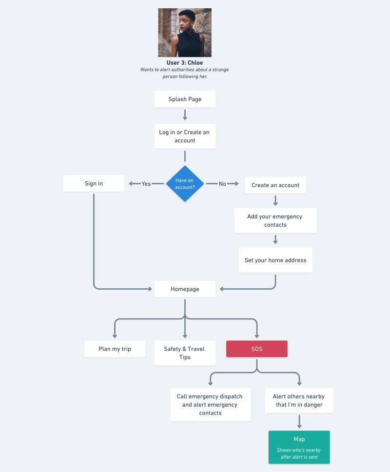
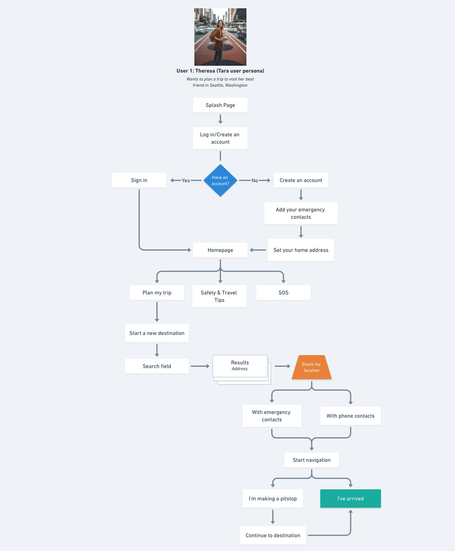
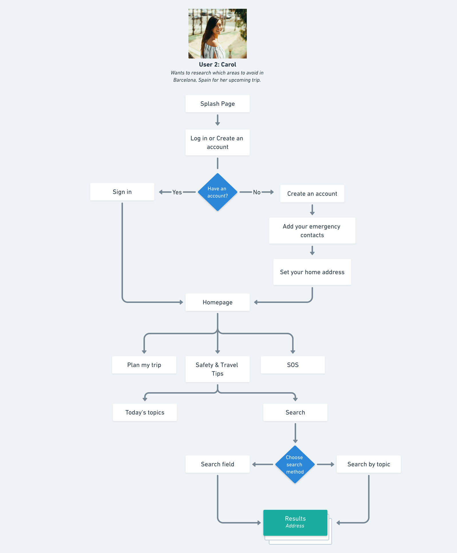
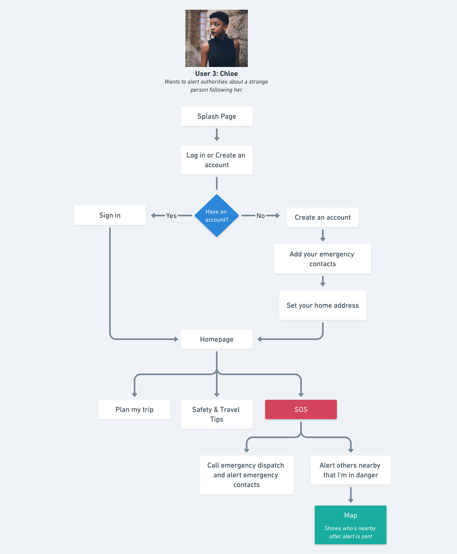
With the site structure developed from the site map, I proceeded with developing user flows. When designing these flows, I took the user personas into consideration.
After I gather all the data I needed, it was time to start the design process. My methodology for the design process included the following:
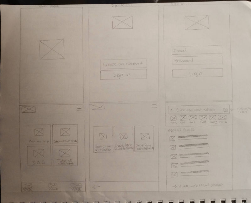
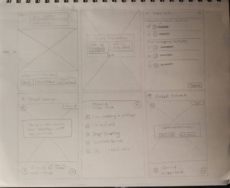
• Initial sketches of wireframes
• Design low-fidelity wireframes in Sketch
• Create a prototype of low-fi wireframes in Invision
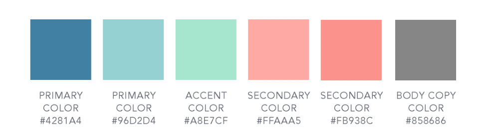
• Develop styleguide
• Conduct usability testing of prototype
• Incorporate styleguide to design hi-fidelity mockups
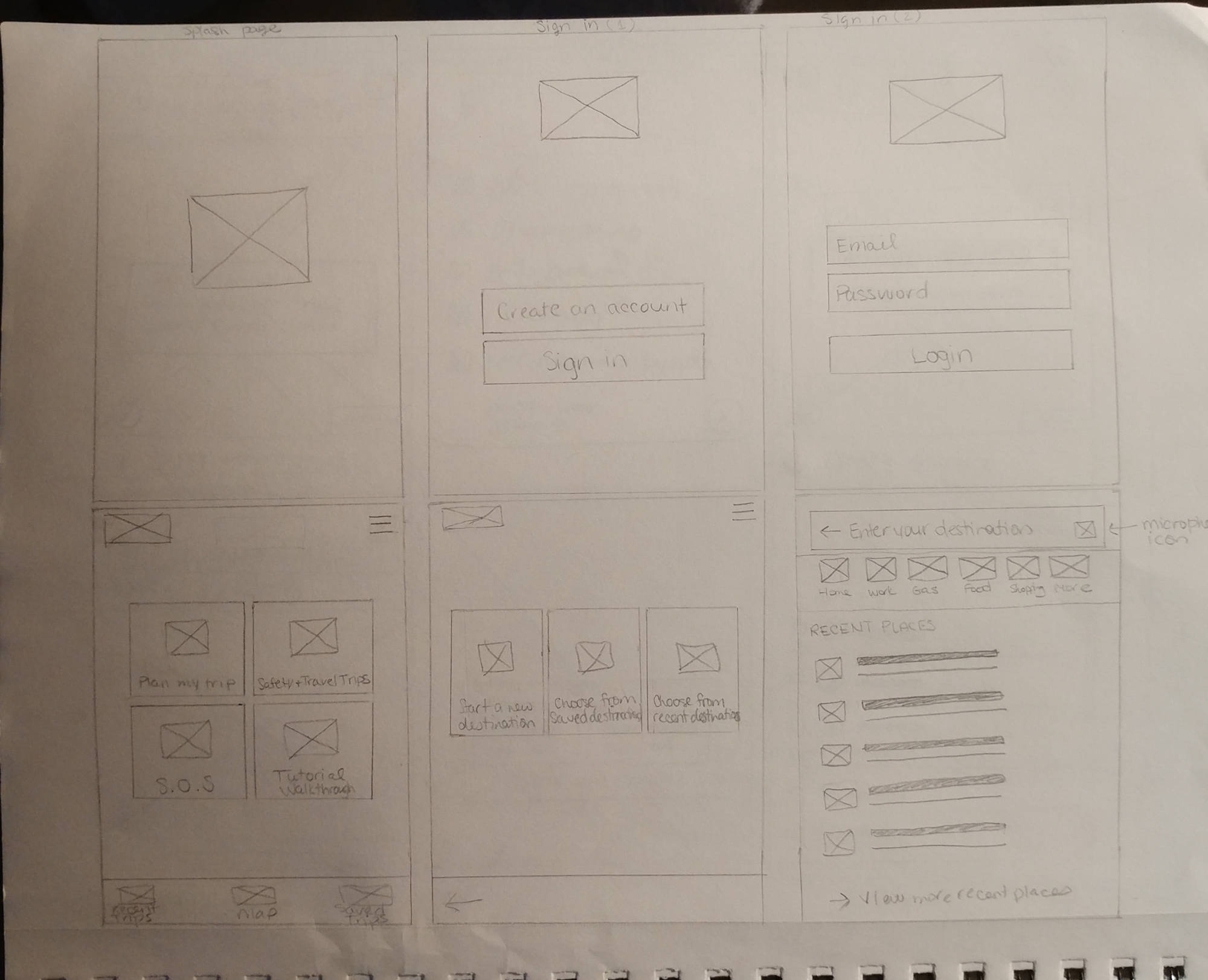
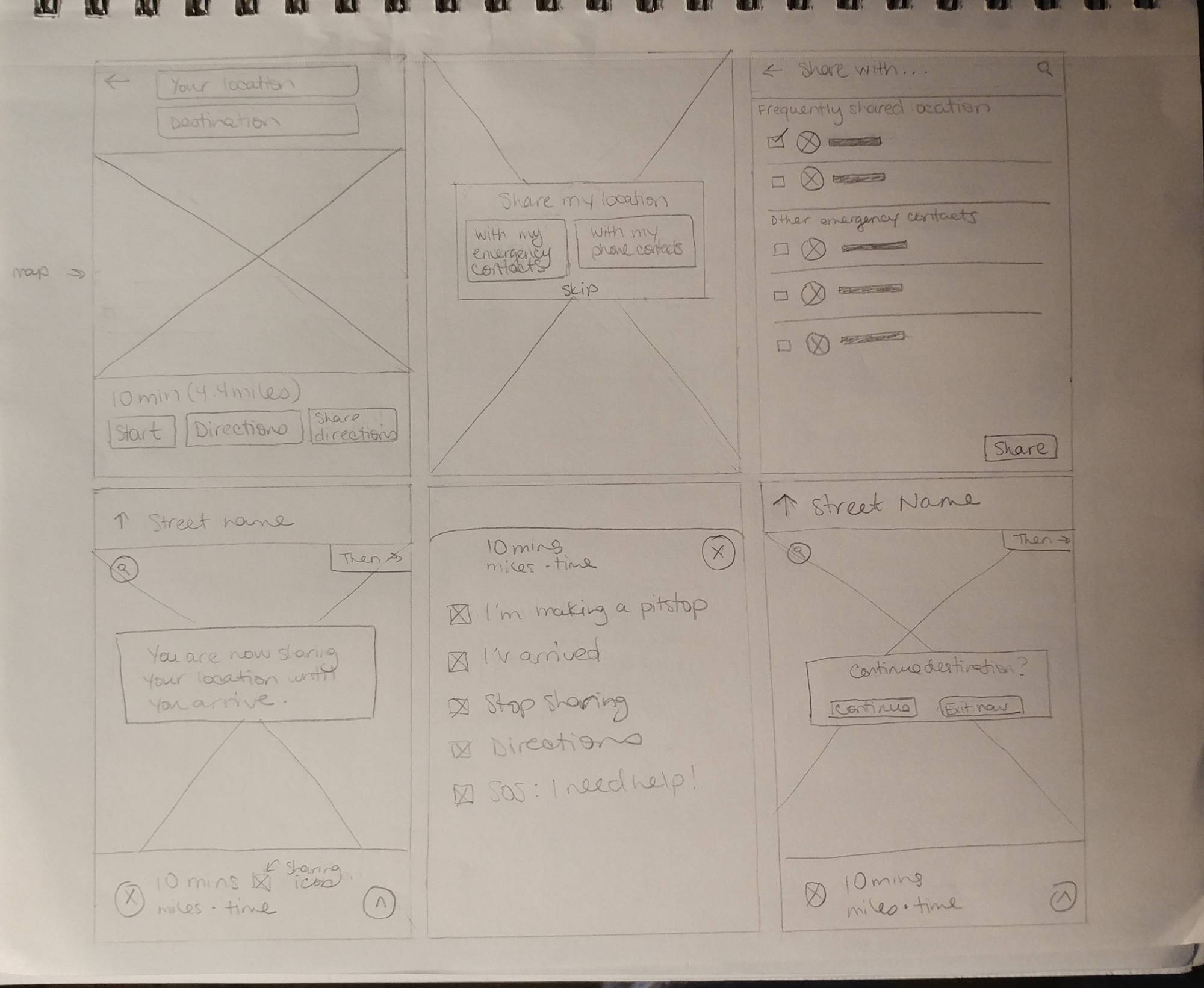
Sketches
Low-Fidelity Wireframes
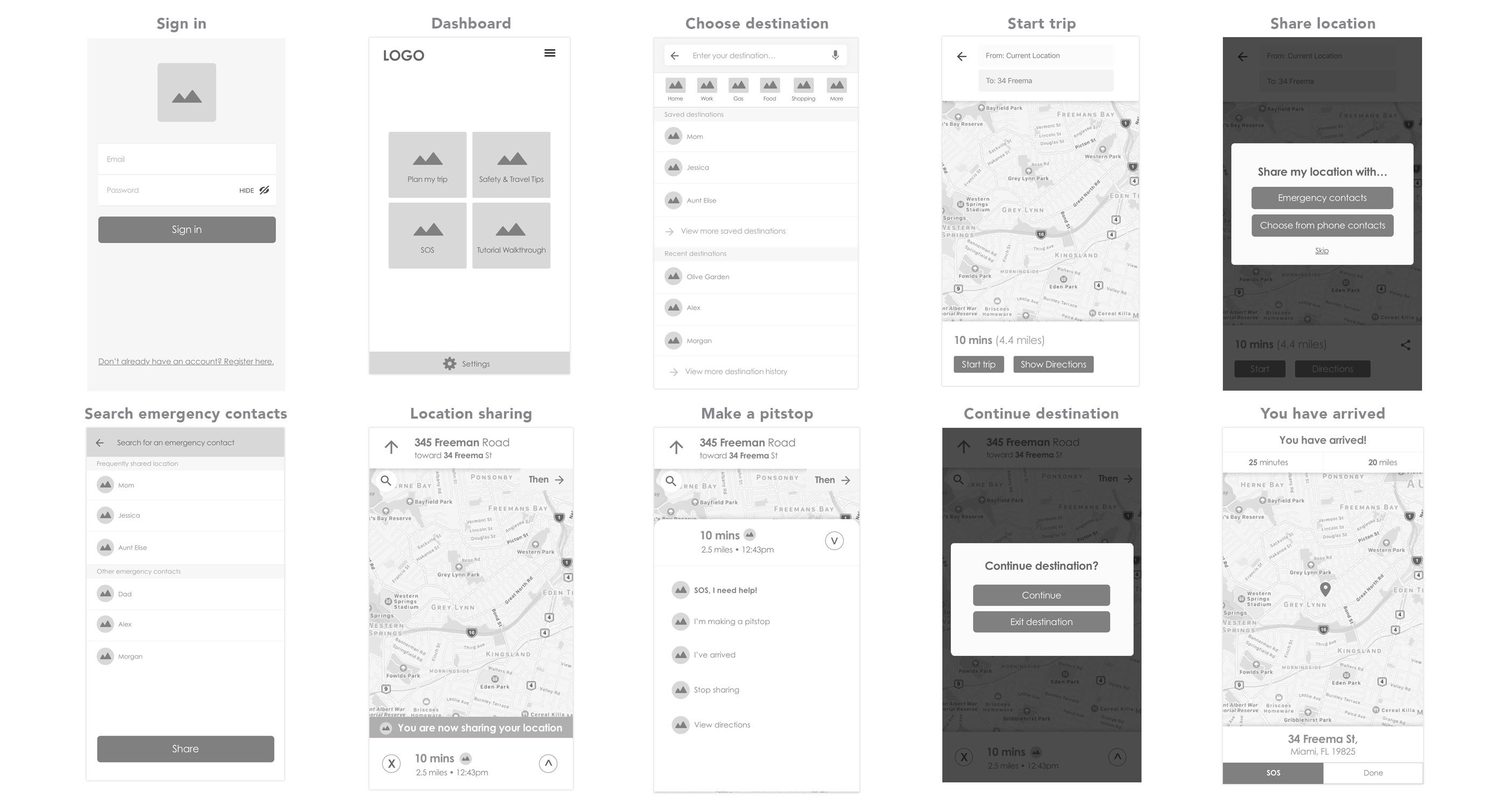
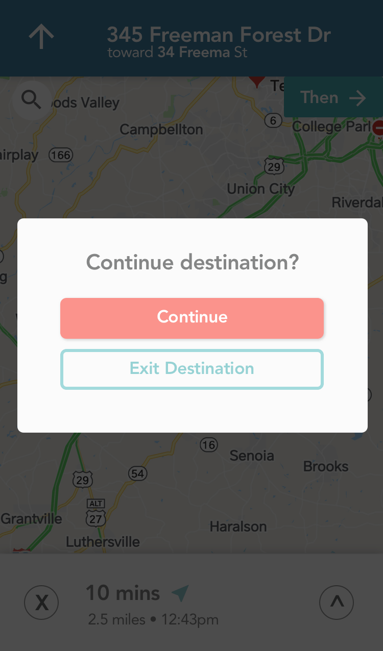
Prototype
After completing the low-fidelity wireframes in Sketch, I created a clickable prototype in Invision.
Styleguide
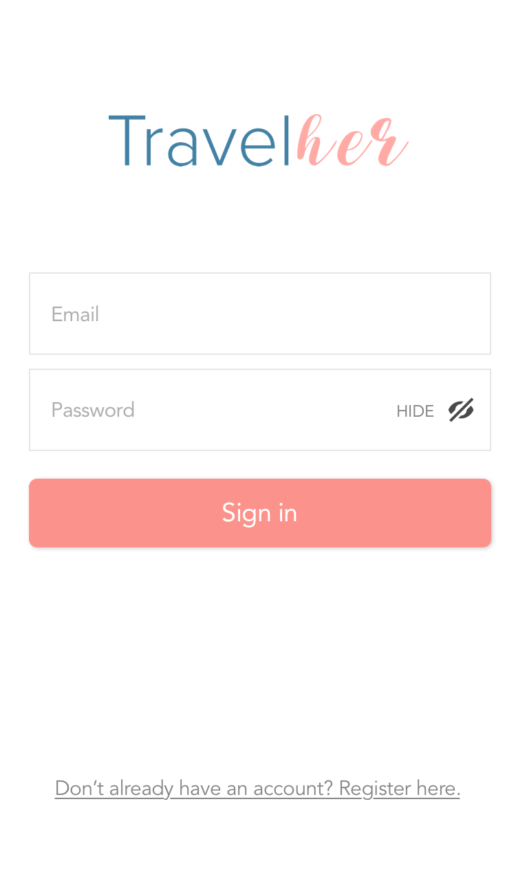
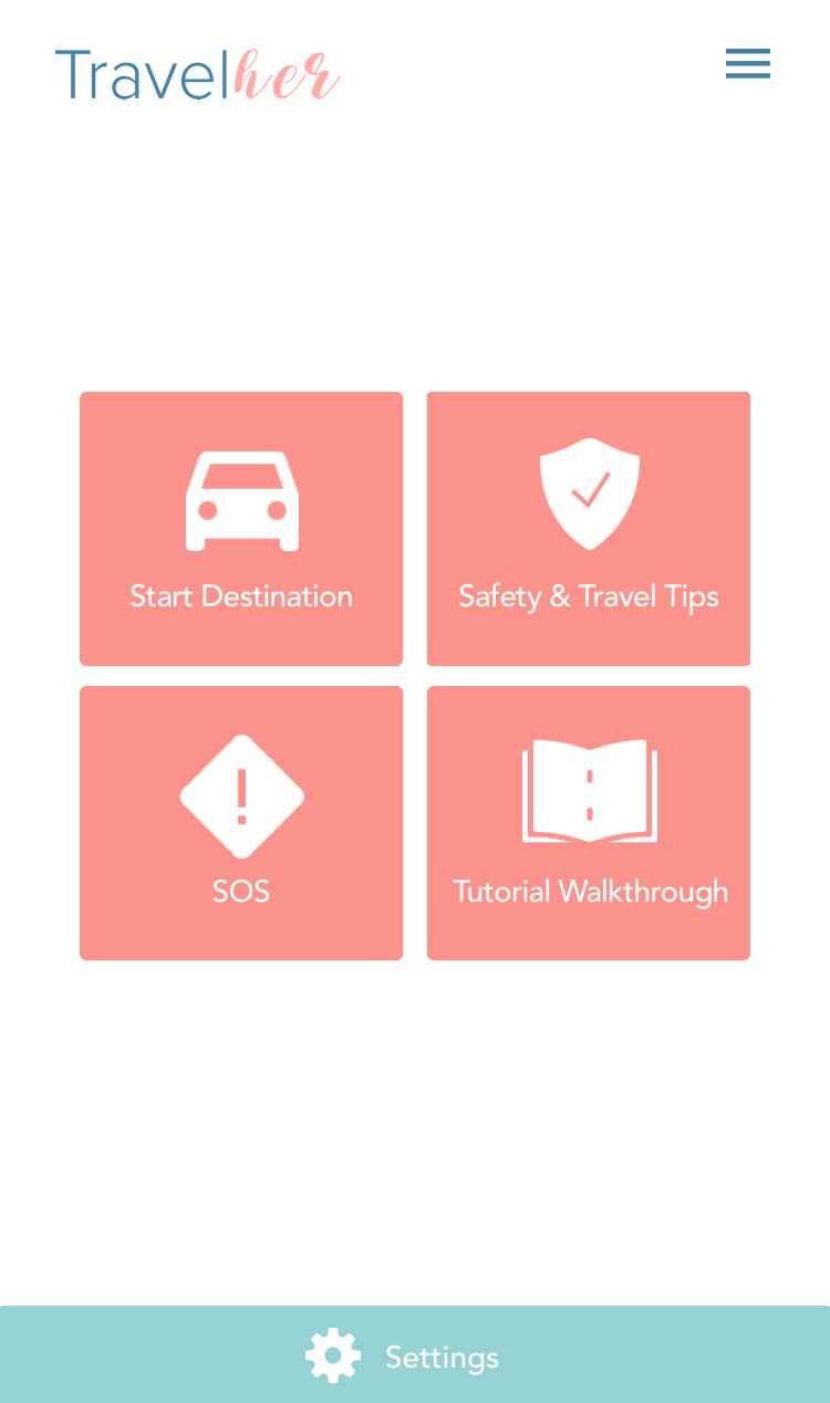
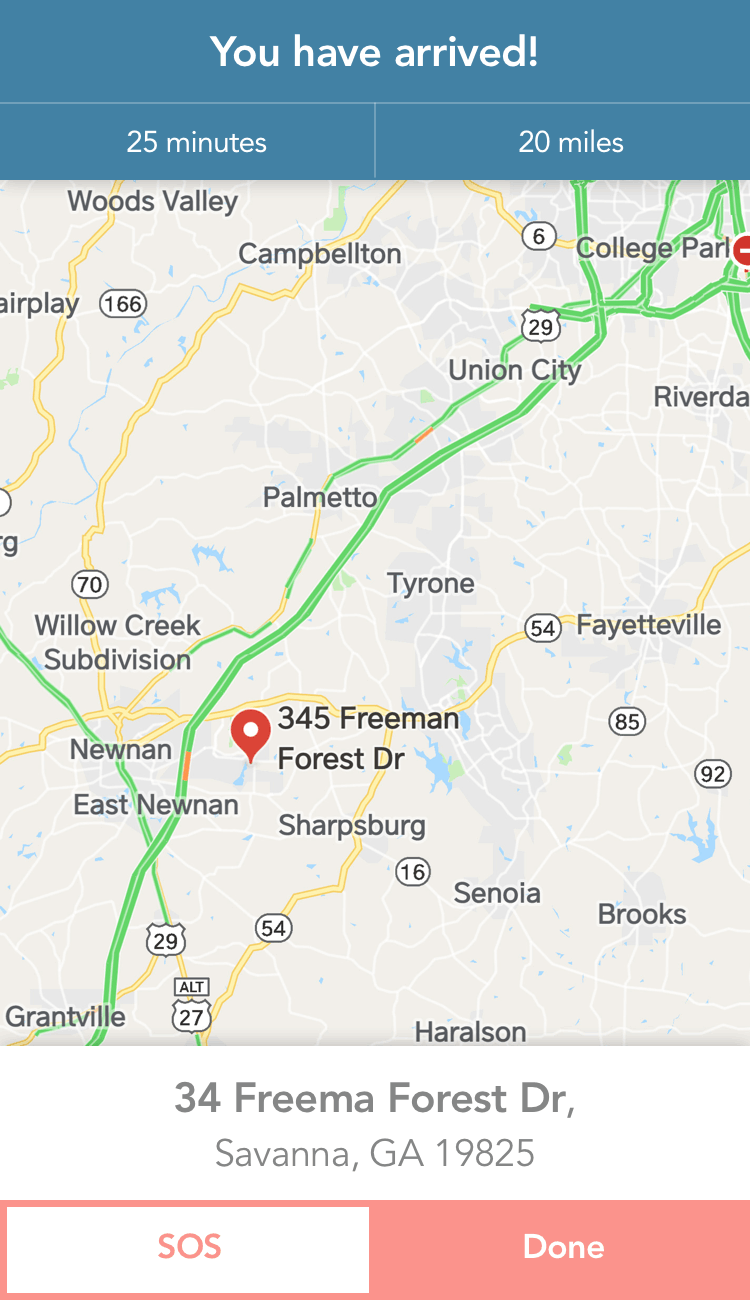
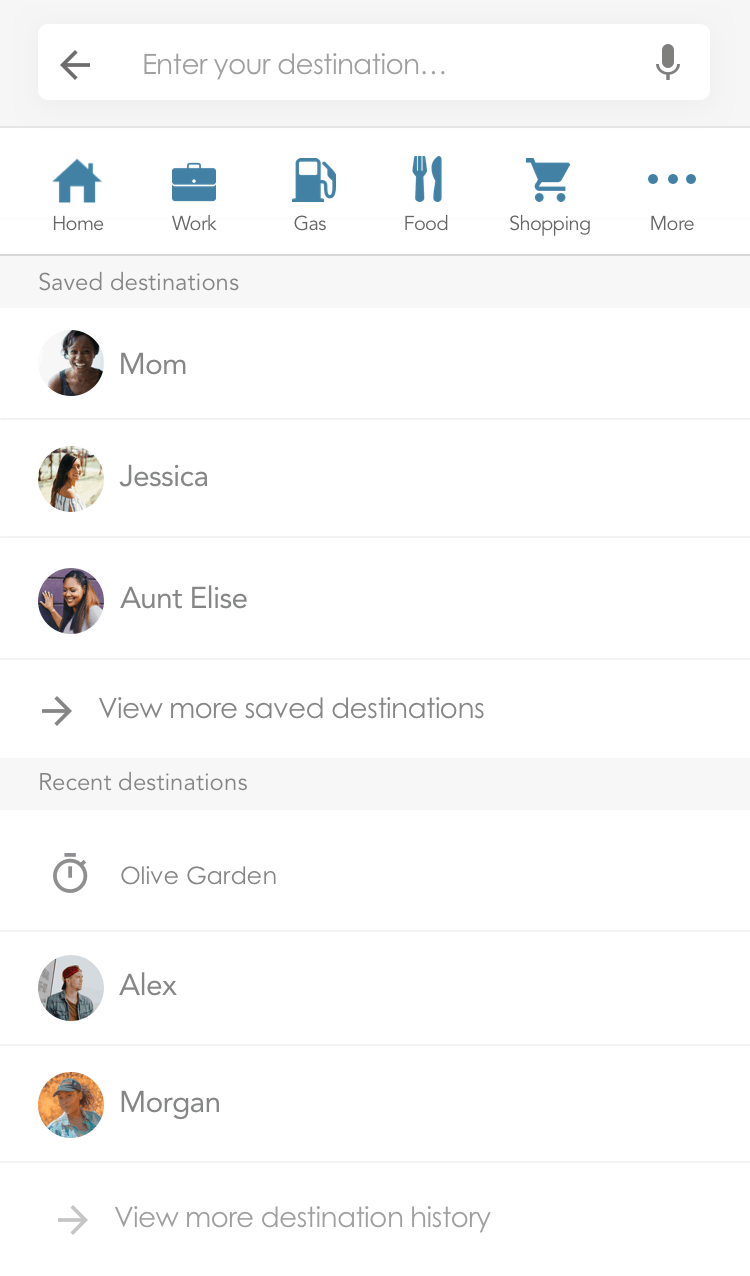
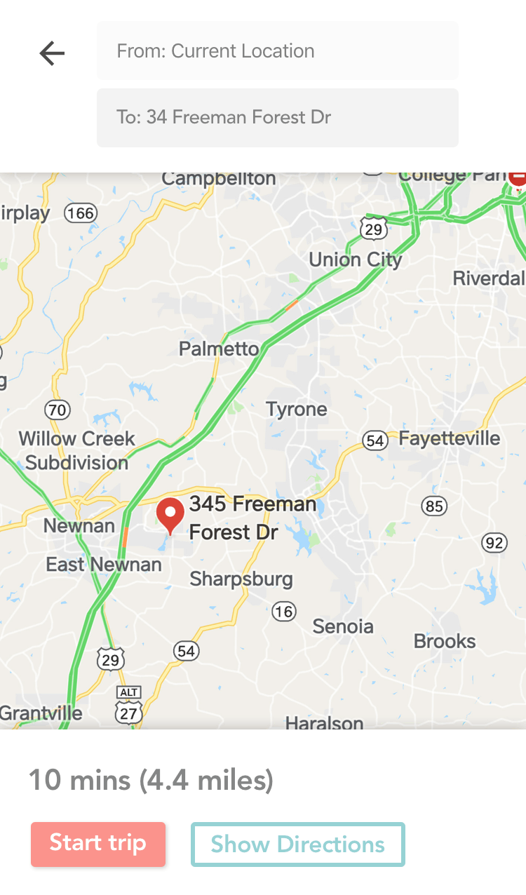
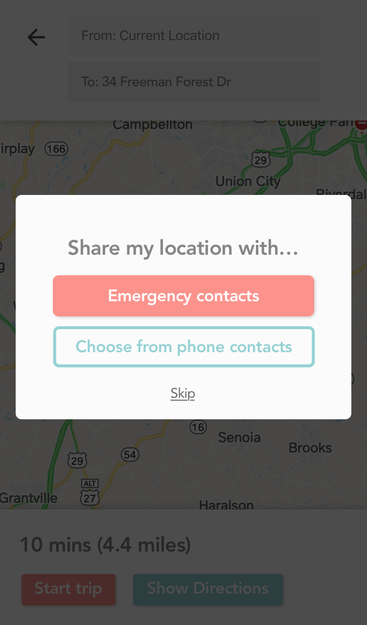
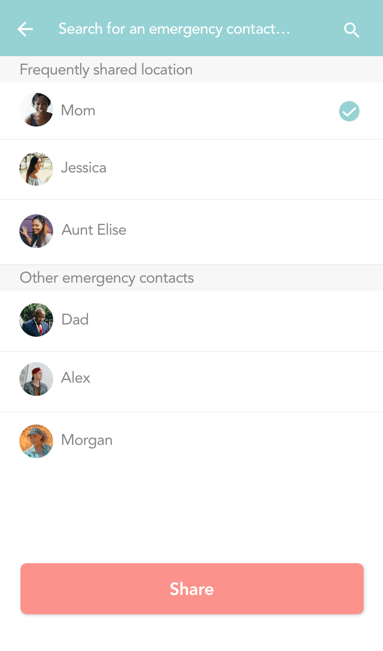
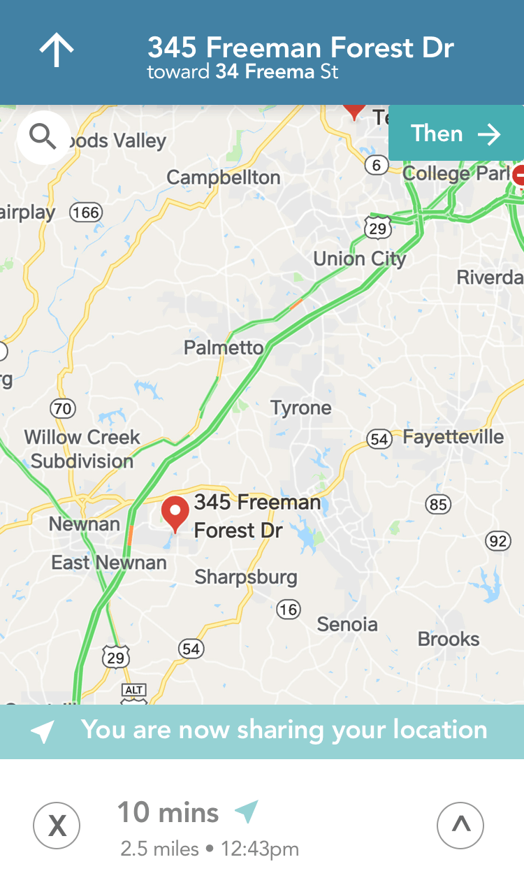
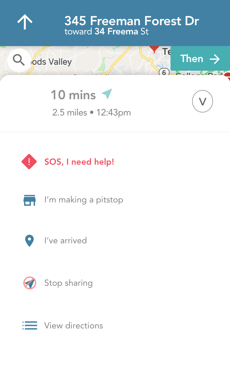
Hi-Fidelity Mockups
After creating the prototype in Invision, I recruited three users for usability testing. I asked them to perform a series of eight tasks to complete in the prototype that highlighted its main features.
Summary of Findings
I conducted three test sessions with three users who fit the “Traveling Tara persona,” women ranging between 24 and 27 years old. I asked them to complete a series of 8 tasks that showcased the main features of the application.
Testing Results
Overall, users were able to complete the tasks required of them. There were a few moments of confusion regarding verbiage for two of the buttons, but they managed to figure those dilemmas out on their own.
User feedback and Recommendations
The users had positive feedback towards the prototype. They enjoyed the features and thought it was easy to use. All of them said they would definitely use it while traveling.
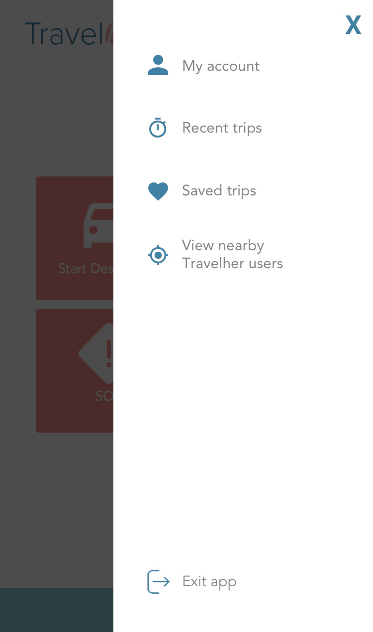
Based on the results of the testing and feedback from the users, I will make the following modifications:
• Change the text for the “Plan my trip” to “Start Navigation.”
• Consider changing the text “Log out” to “Exit.”
• Rethink what options should go inside “Settings” v.s. “My account.”


I changed the log out button to say "Exit the app" so that user would recognize it as a way to leave the app, as well as log out. I might also consider putting this button on the dashboard, rather than inside the menu and test which option has better results. I also removed the "About Travelher" button, as it didn't seem like something users would be interested in reviewing inside the app but perhaps they would on the marketing website for Travelher.